I would like to start with an introduction. My name is Marnix Pot. I work as a BI consultant at Kasparov Finance & BI. In the field of business intelligence (BI), my expertise lies with Microsoft Power BI. I use the blog on this website to write down all my power bi knowledge. Interested? Then I invite you to check out my website and blog!
The topic of the current writing will be an introduction to Microsoft Power BI. Microsoft Power BI will be explained and structured through six aspects:
- Data – The degree of flexibility of the data equals the risk involved!
- Power Query – A final data preparation!
- Model – Try to create a path for Power BI to navigate as efficiently as possible.
- DAX – Calculations as we know them from Excel!
- Visualization – Create the insights you need!
- Service – Time to use it!
The goal is to introduce and structure Microsoft Power BI on a technical level. This will hopefully help the reader gain new insights into both current and future writing.
Data
Microsoft Power BI is originally a tool for data visualization. It cannot function without a data source. Therefore, it is crucial to think in advance about the type of data that will be fed to Microsoft Power BI.
Microsoft Power BI can handle many types of data sources. This can vary from an Excel file to data on an SQL server to a web source. A data source comes with benefits and risks. For example, the Excel data source is a very flexible data source. It’s very easy to make changes. But flexibility also comes with a risk. The risk of someone entering the wrong data or making a mistake. An SQL server is less flexible. It will take longer and more effort to make changes to this data source. This does reduce the risk of errors, because of the effort and checks that must be carried out.
To be able to get started with Microsoft Power BI, it is important to think about the data source in advance and to take the following into account: The degree of flexibility of the data equals the risk it entails!

Power Query
The next phase is Power Query.
The goal of Power Query is to make the data from the Power BI data source worthy. It is recommended that this largely takes place in the data source itself, but it may well be that not every action can be performed here. For example, in Power Query, one can combine data sources, add logic, and make functional changes.
Did you know that Power Query also exists in Excel and serves the same purpose?
Power Query itself doesn’t pose any predefined risk. However, it is important to think about the action that will be taken. Many or a few actions, such as combining data, can affect the performance of the report on a later time. It is advised to only carry out essential actions. If it’s possible to make the change in the data source, it’s highly recommended.

Model
The data has been defined, and Power Query has transformed the data worthy of Power BI. This brings us to the third step: Model.
Microsoft Power BI has spread the data over different data tables with different columns. These data tables can be used for further analysis in the DAX and visualization steps. Before this can be started, it is important to first establish relationships between the different tables.
A relationship is a bridge between two tables where the data in [column 1] of data table 1 has the same value as [column 2] in data table 2. This allows Power BI to compare values with each other and look up which value in table 1 corresponds to the value in table 2.
We can define two types of tables:
Dimension tables.
A dimension table is a table in a star, snowflake or starflake model in which descriptive values about the facts are stored. Dimension tables contain data that can be searched or filtered. In a dataset with data on car sales, the colour, size, and brand are listed in a dimension table. Dimension tables often have a key column with unique values and are linked to the fact table by means of one-to-many (1:). In a star model, dimension tables are often denormalized, while in a snowflake model these tables are often normalized. See also Chapter 3 – The design.
Fact tables.
A fact table is a table in a star, snowflake or starflake model that stores data that can be used to calculate or measure. In a dataset about car sales, the turnover and sales price are in the fact table. Fact tables often do not contain unique values and are linked to the dimension table by means of a many-to-one (:1).
It is important to set up the data model as efficiently as possible. Divide the different tables into dimension and fact tables. Go for one-to-many relationships and try to avoid both – on both relationships. Try to create a path for Power BI to navigate as efficiently as possible.

DAX & Visualization
Microsoft Power BI has been given a way of working by creating an efficient data model. A start can now be made with the creation of a dashboard. Creating a dashboard requires calculations (DAX) and visualizations.
DAX is the programming language of Power BI. It can be compared to formulas used in Excel. There are many different functionalities and ways to write DAX and it is recommended that you do some research on the main ones. DAX codes are used to make calculations such as sums, divisions, lookups, etc.
Example:
They have a table with customer A and customer B. Both have a turnover of 500. The table looks like this:
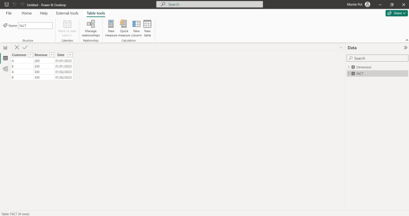
The goal is to visualize A&B’s total revenue. This requires a DAX calculation – Sum [Revenue]. The DAX calculation gives the total of the sum of the [Revenue]. In the visualization, the dimension table is used to divide the sum into A and B.
Keep in mind that, just like in Power Query, DAX can affect performance.
To calculate the sum of the [Revenue] column a visualization is needed to show the result. Power BI has many different visualizations, and each visualization has its specific purpose. For example, a bar chart is very useful to show a difference in lookup values. For example: the turnover for A & B. A matrix can be very useful when it comes to financial statements.
It is advised to think about the dashboard to be created in advance. If you make a design of the dashboard in advance, you can better adjust your data model and DAX calculations accordingly.

Service
The last step involves Power BI Service.
To make the dashboard available for end-users the created dashboard can be published in the Power BI service. Security can be added so that end users only see specific data. Power BI service is the end station of a Power BI development and aims to present and use the presented dashboard.

Conclusion
It is advised to always keep the six steps in mind when creating and managing a Power BI dashboard. Start at step 1 when creating. Start at step 5 and walk back to step 1 when solving inaccuracies or improving performance.
Something to keep in mind:
- Data – The degree of flexibility of the data equals the risk involved!
- Power Query – A final data preparation!
- Model – Try to create a path for Power BI to navigate as efficiently as possible.
- DAX – Calculations as we know them from Excel!
- Visualization – Create the insights you need!
- Service – Time to use it!

